Pattern Mix Magic

Chandan Singh
| 03-07-2026
 · Lifestyle Team
Mixing patterns can feel risky. One pillow looks cute, two feel fun, then suddenly the sofa looks like it joined a circus without permission.
For Lykkers, the secret is not courage alone. Designers use simple visual rules that make different prints feel connected.
Once you understand scale, color, spacing, and rhythm, pattern mixing becomes less scary and much more playful.
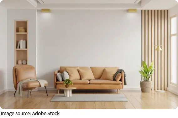
The Designer Logic Behind Pattern Mixing
Patterns look effortless when they have a hidden structure. You may see flowers, checks, waves, dots, or geometric lines, but behind the charm sits a clear system. Once you spot that system, you can copy it in your own room.
Start with one color family
The fastest way to make mixed patterns feel intentional is to keep them inside one color family. They do not need to match exactly, but they should share a visual connection. For example, blue, cream, and soft gray can hold together florals, checks, and stripes without creating chaos.
How the spaces we inhabit shape our thoughts, feelings, and actions every day
How to Create a Reading Nook That Actually Makes You Want to Sit and Stay
The Secret to a Cozy Home Isn't Decor—It's Layered Lighting Done Right
Color, mirrors, and smart decor tricks that make any small room feel twice as spacious without moving a wall.
How to Create a Stunning Gallery Wall in Your Hallway – Tips for Layout, Frames, and Flow
The most-loved living rooms right now have one thing in common — and it's not what you'd expect!
Choose one main color, one support color, and one small accent color. Then let each pattern use at least one of those colors. This creates unity even when the prints are different.
Try this with cushions, curtains, rugs, bedding, or table pieces. Lay everything on the floor first. If the colors seem to talk to each other instead of shouting over each other, you are close. If every item demands center stage, one of them needs a quieter role.
Mix different pattern sizes
A common mistake is using several prints at the same scale. When every pattern is medium-sized, your eyes do not know where to rest. The room can feel busy even if the colors are nice.
Designers often mix three scales: large, medium, and small. A large floral curtain can pair with a medium check cushion and a small dotted throw. The size difference helps each pattern find its own place.
Think of it like a conversation. One pattern speaks clearly. One responds. One adds a tiny rhythm in the background. If all three speak at the same volume, the room feels noisy.
Use simple prints as peacekeepers
Not every pattern needs personality worthy of a dramatic entrance. Simple prints help balance stronger ones. Stripes, checks, small dots, grids, herringbone, and subtle woven textures can act like calm friends at a lively dinner.
If you have a bold rug or wallpaper, pair it with simpler patterns nearby. A striped pillow can connect colors without adding too much visual drama. A small check can add charm while keeping the room grounded.
This is especially useful for beginners. Begin with one expressive pattern, then support it with two quieter ones. The result feels styled, not chaotic.
Leave plain space for the eye
Pattern mixing works better when plain areas exist around it. Solid-colored walls, simple furniture, neutral bedding, or plain curtains can give patterns room to breathe. Without visual pauses, even beautiful prints can become tiring. Plain space is not boring. It is the silence that lets the pattern feel special.
Try stepping back from the room and squinting slightly. If every area feels busy, add calm surfaces. A plain cushion, simple tray, solid throw, or neutral rug can instantly reduce visual pressure.

Practical Tricks You Can Try at Home
Now the fun part begins. You do not need a full room makeover. Pattern mixing can start with one corner, one sofa, one bed, or one table. Small tests help you build confidence without turning your space upside down.
Use the three-pattern formula
A simple formula works well: one hero pattern, one geometric pattern, and one tiny pattern. The hero pattern is the most expressive. It could be floral, abstract, tropical, painterly, or graphic. The geometric pattern adds order. The tiny pattern adds detail.
A large leafy cushion can sit with a checked pillow and a small dotted blanket. Or a bold rug can pair with striped curtains and a subtle textured cushion.
This formula works because each pattern has a job. The hero brings character. The geometric print brings structure. The small print softens the mix. When every item has a role, the room feels designed rather than random.
Repeat shapes quietly
Patterns can connect through shape, not only color. If one print has round flowers, another can include soft dots or curved lines. If one print has sharp angles, another can include diamonds, grids, or zigzags. This creates a quiet link. The viewer may not notice it directly, but the room feels more organized.
Look around your space. Are your patterns mostly curved, straight, organic, or structured? Choose new pieces that echo one of those shapes. This trick is subtle, but it can make a room feel smarter right away.
Balance bold with calm texture
Texture can act like a pattern without looking too busy. Linen, woven cotton, boucle, rattan, wood grain, ceramic glaze, or knitted fabric can add depth while staying gentle.
If your room already has printed cushions and a patterned rug, add a textured plain throw instead of another loud print. It still gives visual interest, but it does not compete. This is helpful for Lykkers who want a layered room but dislike clutter. Texture gives richness without making the space feel like a puzzle.
Test patterns in one small zone
Before mixing prints across a whole room, test them in one zone. A sofa is ideal. So is a bed, reading chair, entry bench, or dining table.
Choose three pieces and arrange them together. Take a photo. Photos reveal visual problems faster than staring at them in real life. If the mix looks too busy, remove one color or reduce one pattern size. If it looks flat, add a bolder print or stronger contrast.
This small-zone method is low-risk. You can learn quickly without buying too much or moving heavy furniture.
Break one rule with control
Once you understand the basics, you can break a rule on purpose. Maybe you mix two bold prints, use unexpected colors, or place a playful pattern in a serious room. The key is control. Let one unusual choice shine while the rest of the room stays steady.
For example, a calm, neutral bedroom can handle one dramatic patterned cushion. A simple dining area can handle a lively table runner. A plain hallway can handle graphic art or a patterned seat. Great pattern mixing has personality. It should not look like a showroom with perfect manners. It should feel like someone interesting lives there and knows how to have visual fun without making the room dizzy.
So go ahead—pull out that floral cushion you were unsure about, grab the striped throw, and add that dotted pouf you secretly love. The rules are here to guide you, not imprison you. Once you understand color, scale, and breathing space, you'll find that pattern mixing is less about perfection and more about playfulness. Trust your eye, test a little, and remember: the best rooms don't follow every rule—they just feel like they do. Your sofa is waiting.
Mixing patterns like a designer is not about guesswork. It comes from color harmony, scale contrast, simple support prints, plain breathing space, and confident small tests.
For Lykkers, the easiest path is to start with one color family, use three pattern sizes, and style one small zone first. Patterns can clash in theory, but with the right structure, they can make a room feel lively, layered, and deeply personal.